Jordan Steele
Designer · Scientist
0   /   100
Responsive Web App

MAX Exchange

Scroll ↓
Goal
Redesign legacy mortage exchange to a centralized next generation platform providing connectivity thru forward-thinking technology supporting lenders and investors for the entire mortgage origination process with minimal risk.
Tools
Figma, Jira, Confluence, Pen, Paper, and...a few stickies
Role
Senior Product Designer

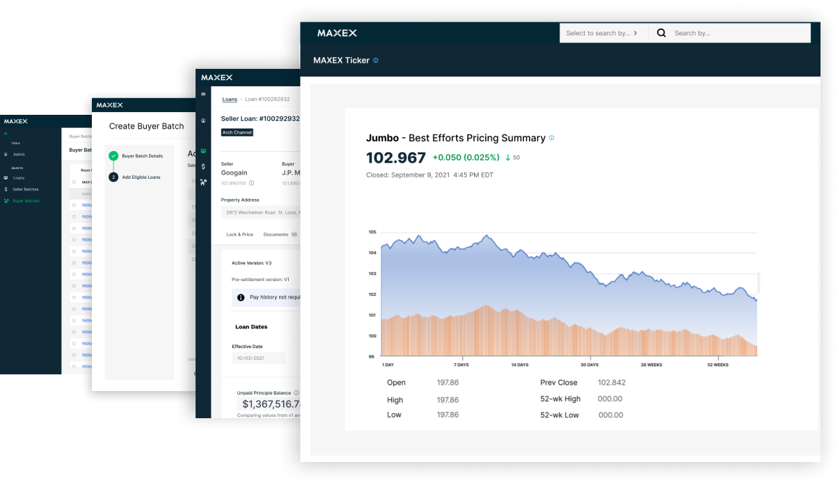
MAX EX vision is the first digital mortgage exchange for buying and selling residential loans through a central clearinghouse. It’s unique ecosystem unifies borrowers, sellers, transaction managers, and investors, spanning all financial markets, MAXEX funding & settlement, MAXEX programs, and MAXEX audit functionality. At the core, it’s smart contract technology supports an automatic and completely transparent system for buying and selling of loans. 

The Challenge

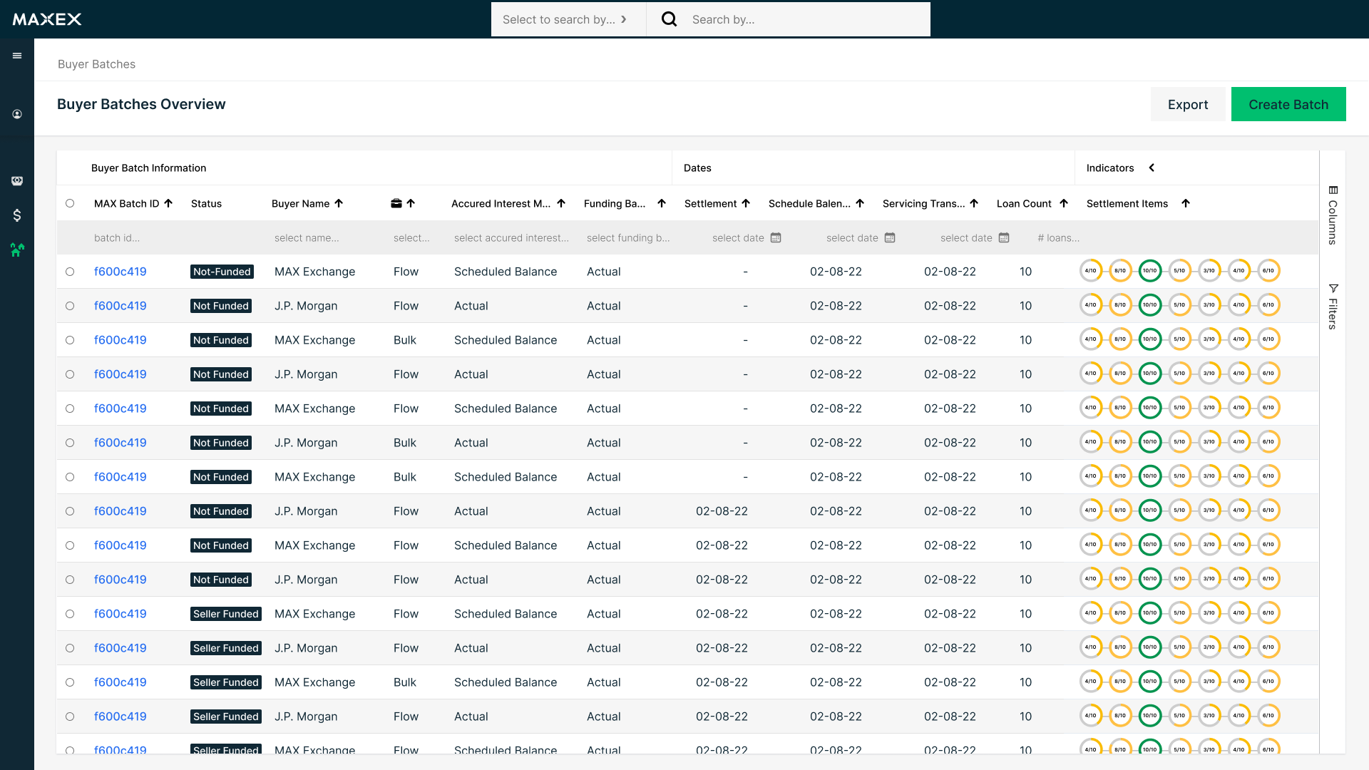
There were growth opportunities both visually and architecturally on the legacy platform. It focused heavily on traditional navigation and siloed features on individual pages. However, with their demand to transition to a modern next generation platform, the team at MAXEX wanted to produce a separate  react application that supports the funding and settlement workflow and synced with legacy database.

Key Issues

 
The legacy platform is not responsive.    Crammed top navigation with too many pages.   Many manual processes using third party tools causing gaps in processes .     Visually outdated along with technology.

Competitive Analysis 

 
I began researching financial technology companies  to gain a better understanding of UI patterns and any unique interactions.

MTrade »

What caught my eye was their strong analytics and data visualizations - providing a terminal experience. The dark theme is great for visibility  and preventative of eye strain. 

  • Home/Dashboard,  Menu/Navigation,  Quick Price Compare, Conversion Flow, Data Visualizations

Polly »

A modern platform with clean UI/UX components. The navigation, and patterns seen within screens are familiar yet improved, i.e. Overview pages > Detail pages. 

  • Menu/Navigation, Overview Page, Advance Filtering & sorting, Detail Page, Form Optimization.

Stackfolio »

Offer a powerful task management system with real-time notification alerting users when reports, documents, and loan milestones have been verified & completed. 

  • Action Center, Notifications, Conversation Tools, Automated Tasks

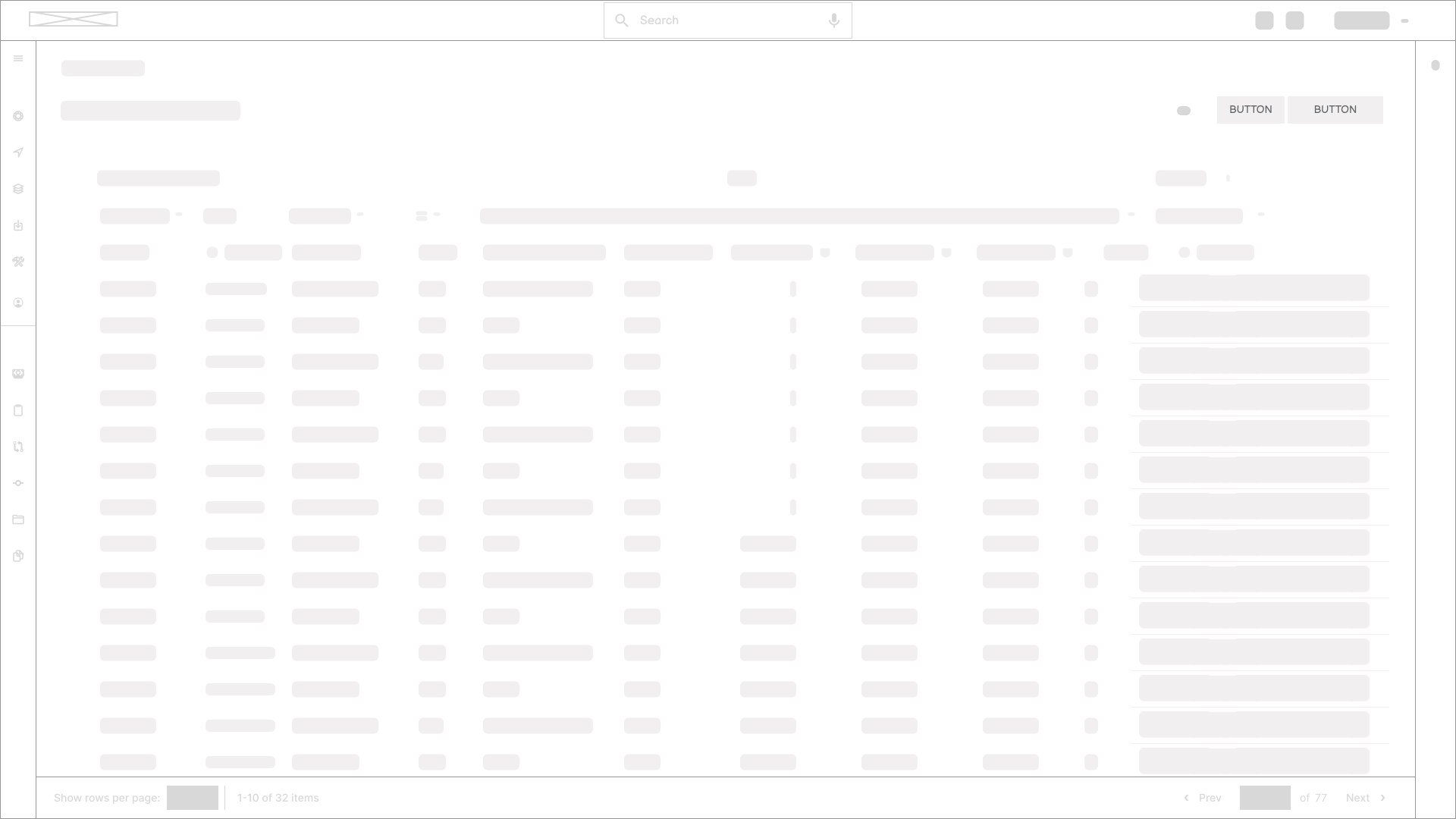
One of my favorite parts of the design process is getting the whole team in a room and white-boarding ideas, iterating on sticky notes and building something using everyone's strengths. It's magical every time and the best team-building exercise.

Making this project remotely meant finding new ways to collaborate. Thankfully the team at Figma (those glorious souls) recently released FigJam. For the session, we invited team members from Sales, Operations, Product, Engineering, and Design to help us align on the best approach forward.

Design Exploration

Outcome

Want to learn more about this product?

Get into this project's details from its design process, explorations, several iterations and prototypes. Learn how the final design performed and how it helped the organization streamline workflow processes.

Skip to content